If all you see after pressing Save is "An error occurred," you stop. You cannot tell whether you should fix your input, sign in, or press the button again. When you refine an error message, look at the wording and the buttons together. What was confirmed, what the user can do right now, and where their unfinished text is kept should all connect.
Take a fictional reading-notes app as an example. The screen has a required "Title" field, an optional "Note" field and a "Save" button. The title is left blank, and the note says "Today I wrote down the choices the characters made." This post treats three situations separately: a missing title, an expired sign-in, and a save request that gets no response. They are easy to lump into the same failure screen, but each needs a different next action.
When the title is empty, point to the place to fix it
If the user saves with the title blank, tell them both that the title field has a problem and how to fix it. "The title is empty. Please enter a title." is more specific than "Invalid input." Leave the note as it is, and let them save again once the title is filled in. There is no reason to make users retype what they have already written.
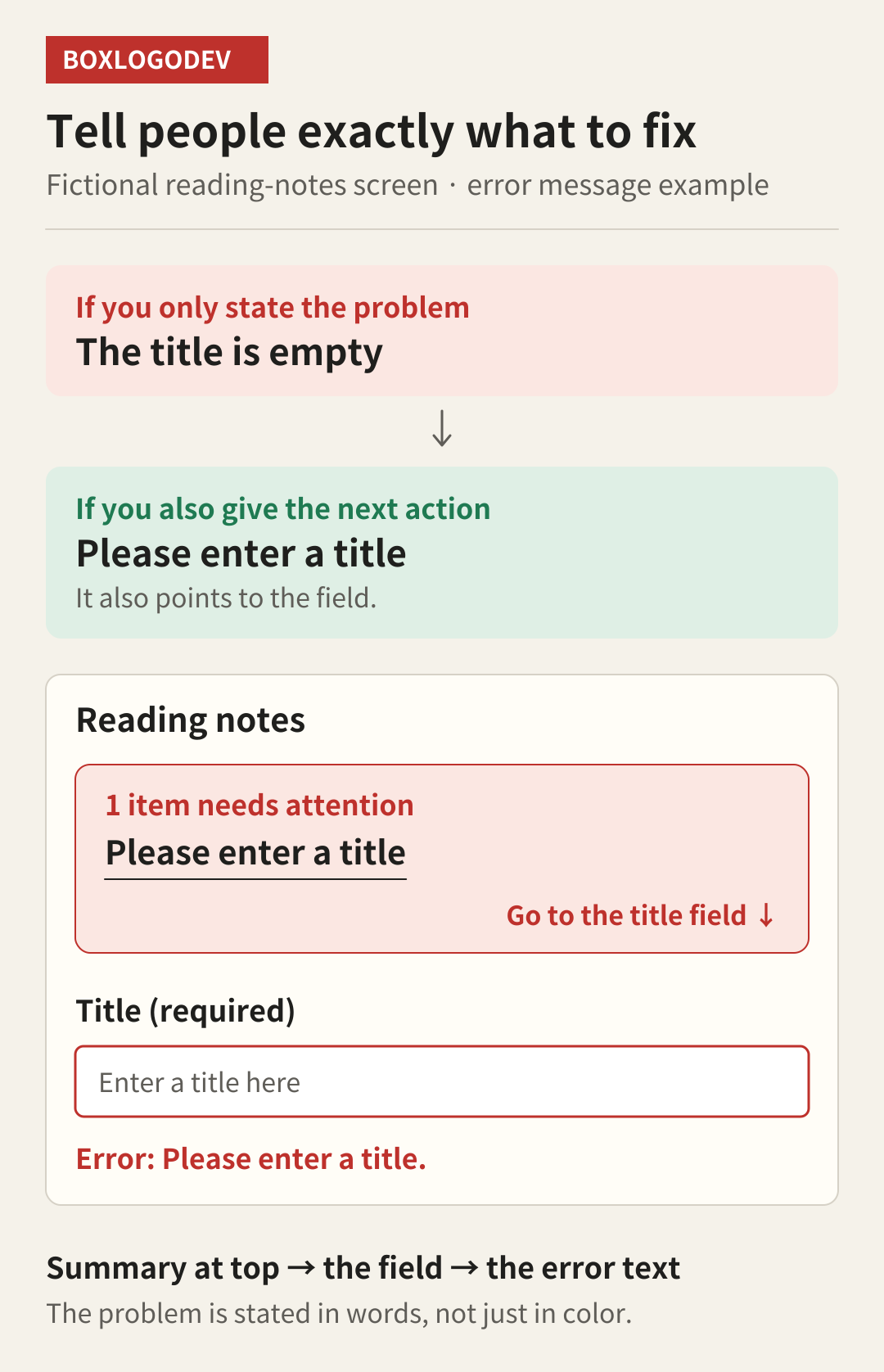
Around the field, place the field name "Title" and the error sentence close together. Do not stop at turning the border red; state the problem in visible text. People who find colors hard to tell apart also need to know which field to fix. The relationship between the input and its description should also be exposed to screen readers. On web forms you can consider a connection such as aria-describedby.
When there are many fields, or an error is off screen, a summary above the form such as "1 item needs attention" helps. Selecting "Please enter a title" in the summary moves focus to the title field. This does not mean every form must carry the same error summary. In this example I chose to pair guidance that finds the overall problem with guidance at the spot where it is fixed.
Building the summary is not the end. Check that keyboard users can reach it and jump to the title field, and that the old error disappears once the title is fixed. Errors that appear later also need a way to announce which part of the screen changed. Design making a message visible and making sure users actually discover it together.
When sign-in expires, say where the draft is
Now suppose the title is filled in as "Fictional Book A," and the sign-in expires before the save request is processed. If the app has confirmed that authentication expired, it can say "Your sign-in has expired. Please sign in again." But if pressing the sign-in button takes the user away from the editor, the thing they most want to know is still missing: will they be able to see the note they just wrote?
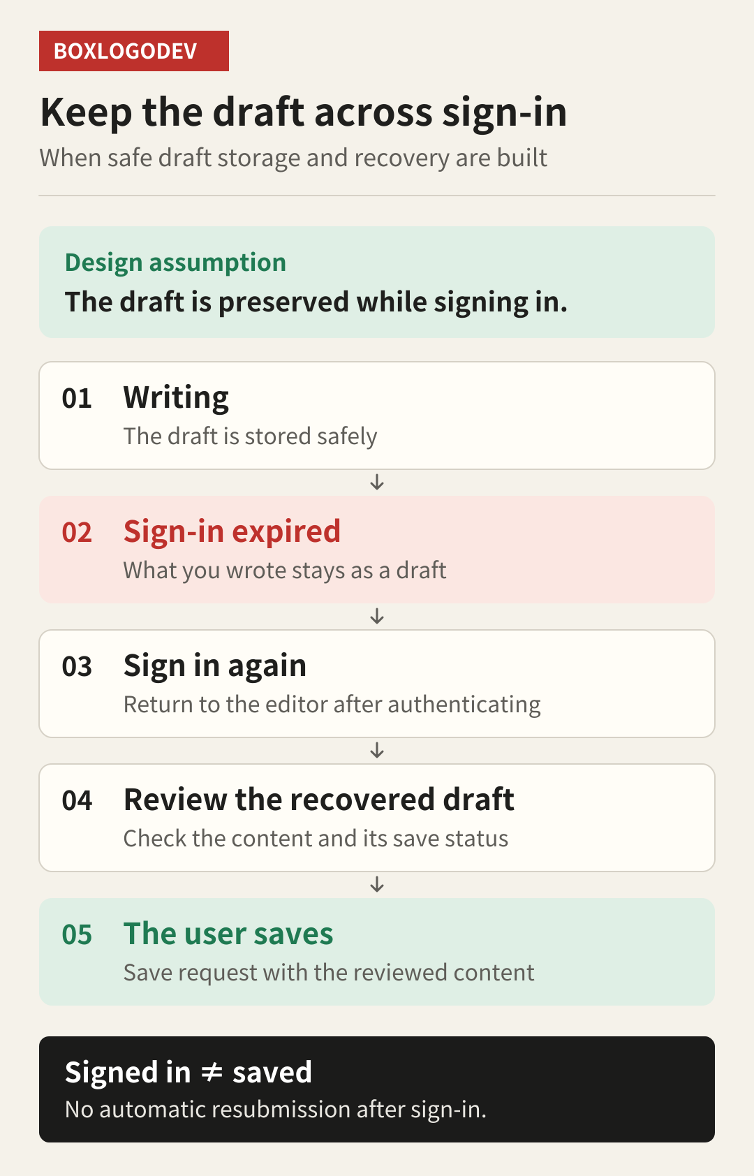
The recovery flow in this example assumes the app can store the draft before moving to sign-in and restore the unfinished content when the same account comes back. Only after confirming that the draft was stored does it say "Your writing has been saved as a draft. You can continue after signing in." The fact that the note is still on screen does not justify promising it will be recovered after the user leaves the page.
If there is no recovery feature, describe the path that actually exists. For example, let the user copy the content from the current screen and say "Please copy what you wrote before going to the sign-in screen." It is less convenient, but clearer than claiming to have kept content that was not kept. Also decide where and for how long drafts are stored, and make sure they are not restored to the wrong person when someone signs in with a different account.
Confirm sign-in completion and note saving separately. The example app shows the returning user the recovered title and note and offers the Save button again. It does not automatically resend the earlier request just because the user is signed in. A message about the current state, such as "We recovered the note you were writing. Please review it and save," also reduces the chance that users mistake draft recovery for a final save.
If there was no response, check the save result first
The third situation needs more care. The title and note are filled in, the user presses Save, and no response arrives. The request may never have reached the server, or the note may already have been saved and only the response was lost. Declaring "Save failed. Please try again." here can lead the user to create the same note twice.
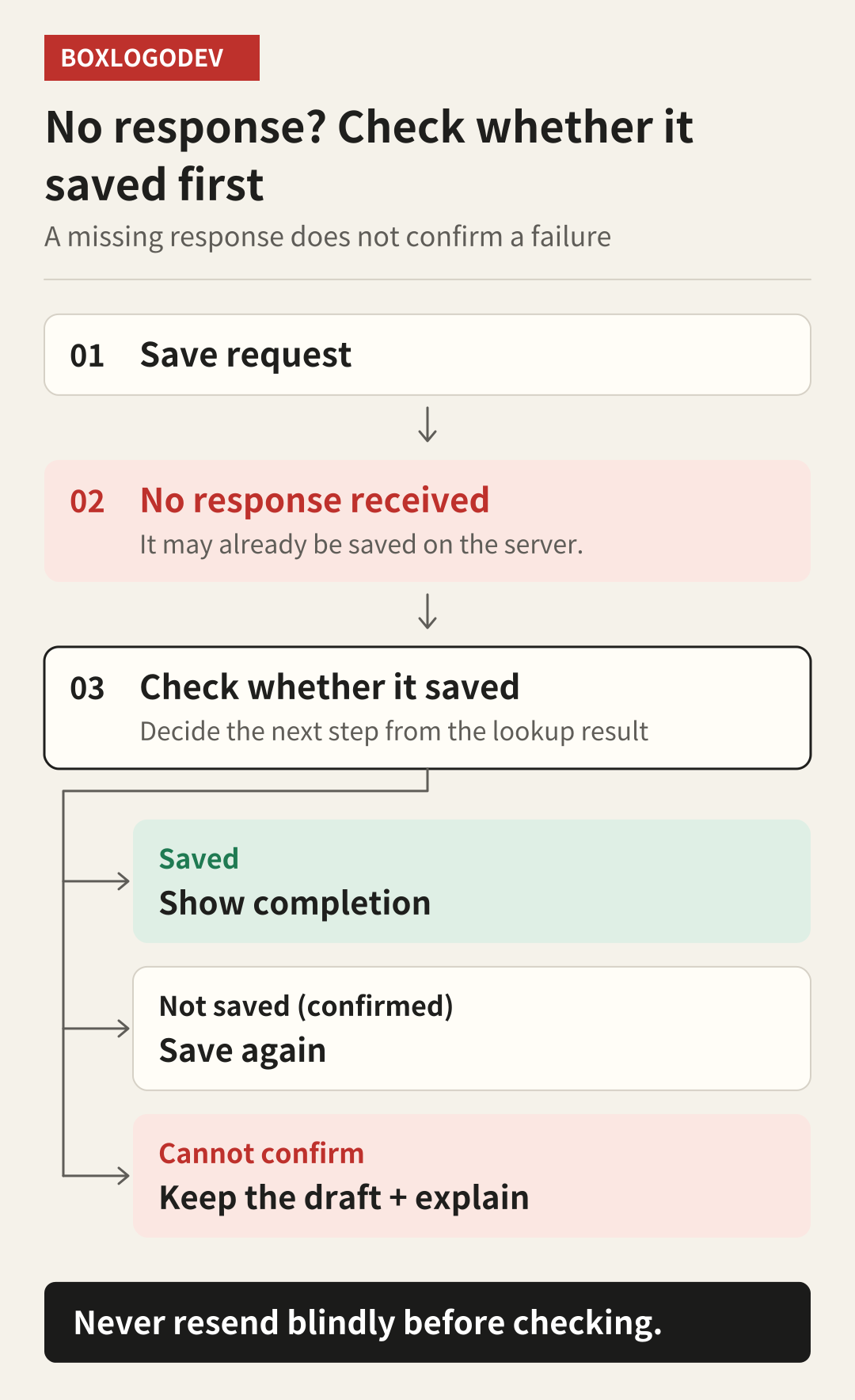
The example app's first message is "We couldn't confirm whether it was saved. Your writing is still here." The next action is "Check whether it saved." This button is designed to look up the result of the earlier save request instead of sending the same note again. If the lookup finds the saved note, open and show it. Allow saving again only when it is certain that the original request was not processed.
Deciding it was not saved just because the same title is missing from the list is risky. The list may update late, and another note may have the same title. During development, decide on a value that identifies the request or the note, and build a path to check the result. If processing is still ongoing or even the lookup fails, keep a "Checking" or "Result needs checking" state rather than turning it into a button that blindly resends.
If this flow is hard to build, at least keep the draft and tell the user that the save result is unclear. Give them a way to copy the note or check their saved items later. A server design that prevents duplicate processing lets you improve the retry policy further, but you cannot solve duplicate saves by changing button text alone. What the message promises must be supported by what the feature actually does.
After reading the wording, check the next screen too
When you review the design, prepare the three input states above separately. For the empty title, check the title guidance and that the note is kept. For the expired sign-in, check the draft storage result and restoration after sign-in. For the lost response, check the result lookup and duplicate-submission prevention. On success, show the saved title and content so the user can confirm the task is done.
The screens and sentences here are fictional design examples. They are not results of testing a real app, browser or screen reader. After implementing, check keyboard navigation, the order in which error messages are read, draft restoration and the dropped-response scenario one by one. A kind error message can start with one polite sentence, but it only does its job when it connects to the screen where the user carries on with their work.