People in a landscape painting usually work as a yardstick. A standing figure tells you how tall a house is or how wide the sea. Lay J. M. W. Turner's paintings out in the order he made them, though, and this yardstick keeps shrinking until it disappears. How small do people become in Turner's paintings?
This note looks at four of Turner's oil paintings, from 1811 to about 1845, released into the public domain by The Metropolitan Museum of Art and the Cleveland Museum of Art. By the end you will be able to check two things for yourself in front of any landscape: how many centimetres the most visible person measures on the canvas, and whether you can still count the people one by one.
Joseph Mallord William Turner (1775–1851) was a British painter, born and died in London. Three of the four paintings here were shown at the Royal Academy in London.
Before measuring: the four canvases are almost the same size
Comparing sizes only works if the pictures are comparable. According to the museum records, all four are canvases about 90 cm high and about 121–123 cm wide. So when you measure a figure as a fraction of the picture's height in the image, you can carry that fraction almost directly over to centimetres on the actual canvas.
The figures below are rough measurements: in each painting, one of the clearest figures, measured from head to foot on the museum's image reduced to 1,600 pixels wide. They are not museum measurements and could easily be off by a few millimetres.
Saltash, 1811: people lead the scene
The Met describes this painting as a product of Turner's journey to the west of England in summer 1811. Saltash is an old market town in Cornwall, joined for centuries by ferry to Devonport and Plymouth across the River Tamar.
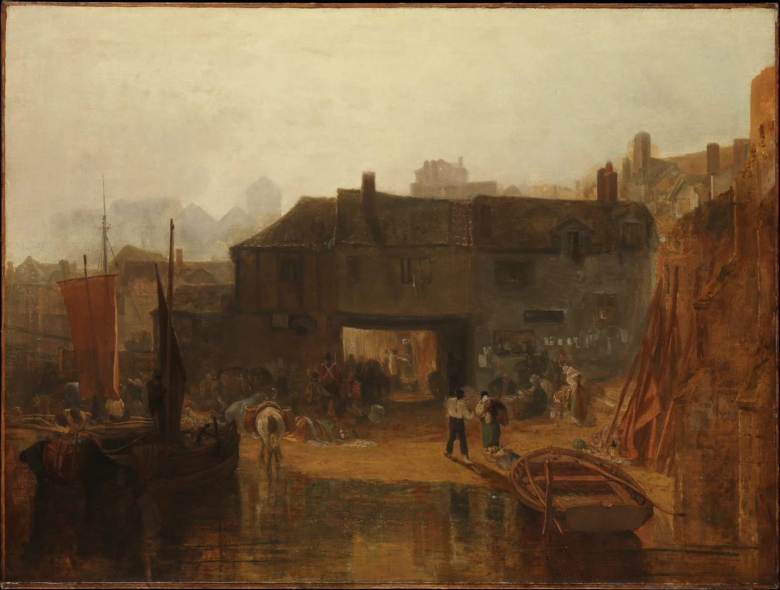
Low in the centre, on the muddy shore, a man in a white shirt stands with his back to us. A round load sits on his shoulder, and beside him a woman in a headscarf and a green skirt bends over with a basket at her feet. The man is about one ninth of the picture's height, a little over 10 cm on the canvas. The folds of his shirt, the dark side of his trousers and the shadow slanting across the ground are each painted separately, so you can read what these two are doing. On the left are a white packhorse with its load and a sailing boat, and in front of the arch a figure in a red coat stands among a group of people.
The composition also points to the people. The dark band of the building crosses the picture, and only the arch in its middle is left bright. The eye moves between that bright opening and the two figures in front of it. The sky is a dull yellowish haze, but the Met notes that the sky is damaged while the lower half is well preserved, so it is safer not to read that haze as the painter's intention. In a letter of 1852 quoted by the Met, the critic John Ruskin described the painting as what the mind sees when it looks for poetry in humble actual life. At this stage, people are the masters of the landscape.
Venice, 1835: people are a few white strokes
According to the Met, Turner took the composition from a slight pencil drawing made on his first trip to Venice in 1819, but the painting is really the outcome of his second visit, in 1833. It was shown to wide acclaim at the Royal Academy in 1835.
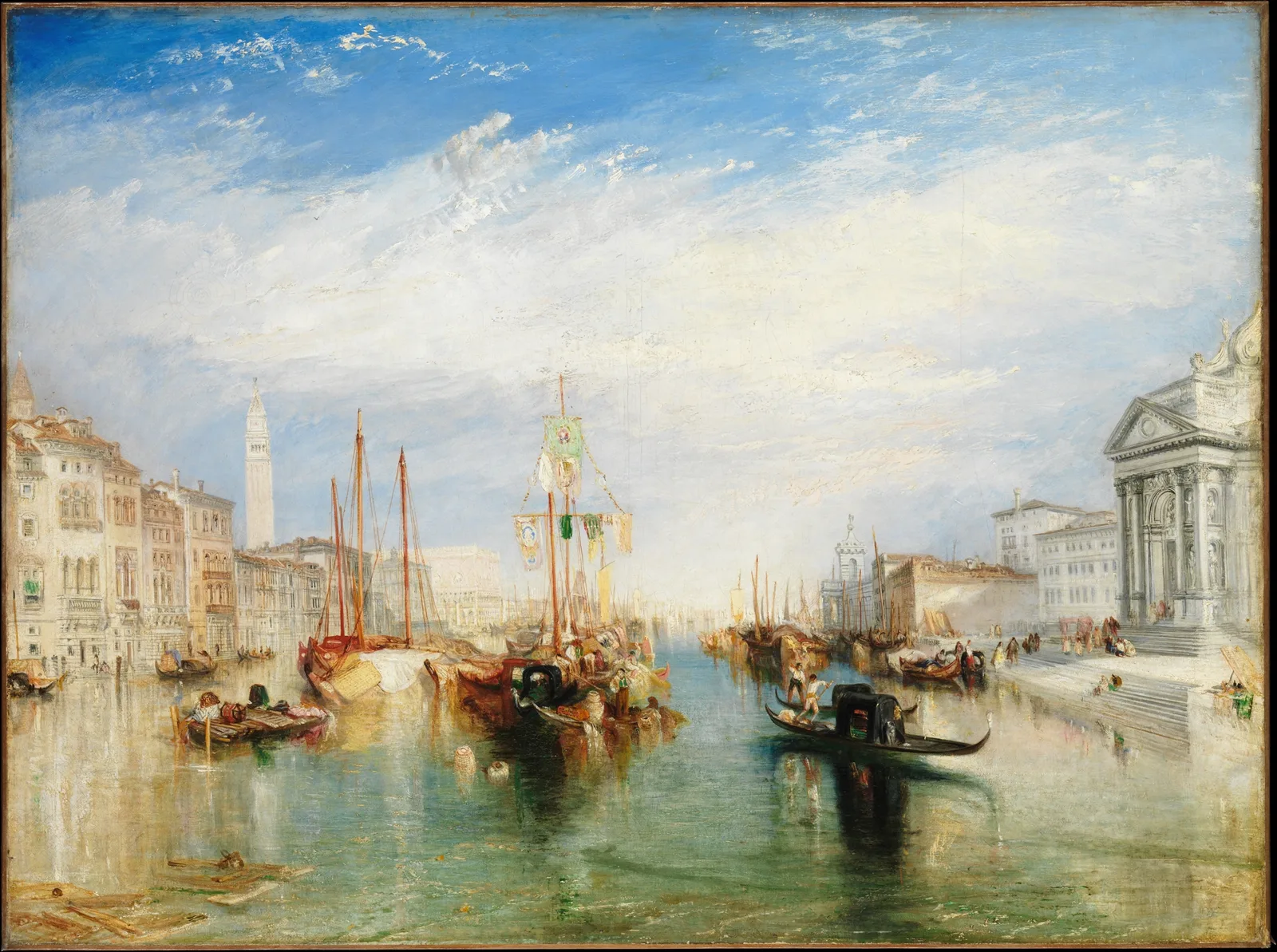
More than the upper half of the picture is sky. White paint is rubbed thickly over the blue to make the clouds, and that white carries on down into the buildings and the water. The church front and steps on the right and the walls of the palaces on the left share a similar cream colour, so the buildings look less like solid blocks than like surfaces catching light. The water is turquoise, and where the foot of each building is reflected, the line between wall and water melts. The Met, too, describes the foundations of the palaces merging into the water through delicate reflections.
Where are the people? On the black gondola in the middle, two boatmen in white shirts are rowing. Up close, a shirt is a few touches of white, a sash is one yellow dot, and a face is an apricot smudge. The standing boatman is about one twentieth of the picture's height, around 4 cm on the canvas. The people on the church steps at right are smaller still, dabbed in as pink, black and white dots. Yet these people are not in danger. The black hull of the gondola and its shadow are the darkest place in the picture, so the eye goes to this small boat first. People have shrunk, but in all this wide light they still act as a pause.
The burning of Parliament, 1835: people become a crowd
On the night of 16 October 1834, the Houses of Parliament in London burned. The Cleveland Museum of Art explains that people gathered along the banks of the Thames to watch, and that at first a low tide made it hard to pump water, so the blaze burned out of control for hours. Turner showed this painting at the Royal Academy the following year.
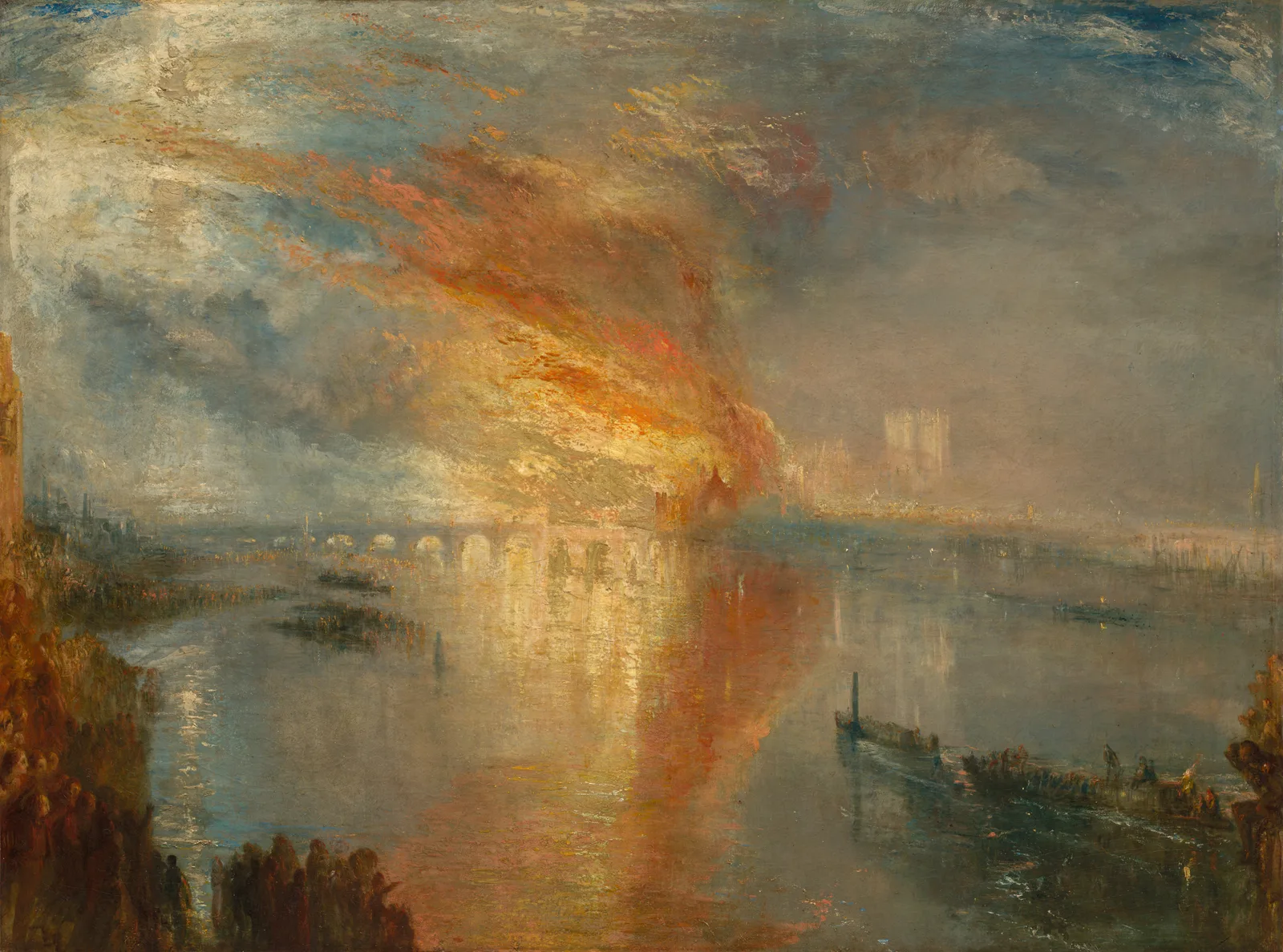
The fire owns the picture. Orange, crimson and lemon yellow sweep diagonally from the centre to the upper left and cover half the sky. The same colours are reflected in the river, so a red column stands once more, downwards, in the water below the bridge. The fire rising and the reflection falling split the picture vertically. The Cleveland Museum of Art says Turner based the painting on an actual event but magnified the height of the flames.
People appear only along the bottom edge. On the bank at lower left, dozens of heads overlap as a reddish-brown mass. Up close you can see the round outlines of heads and shoulders, but no eyes, noses or mouths, and where one person ends and the next begins is lost in the brushwork. At lower right, people standing in the boats are short dabs of red, yellow and blue; one standing figure is about one fortieth of the picture's height, a little over 2 cm. The museum says these boats heading towards the flames record the struggle against the fire. Here people are no longer painted one by one. They are a single dark band: the watching crowd.
Whalers, about 1845: when you cannot count the people
According to the Met, Turner showed this painting at the Royal Academy in 1845, when he was seventy. It and three other paintings now at Tate in London were inspired in part by Thomas Beale's book The Natural History of the Sperm Whale (1839). The Met adds that the picture's admirers and detractors alike agreed on one thing: the tumultuous whale and whaleboats in the foreground were hard to tell apart.
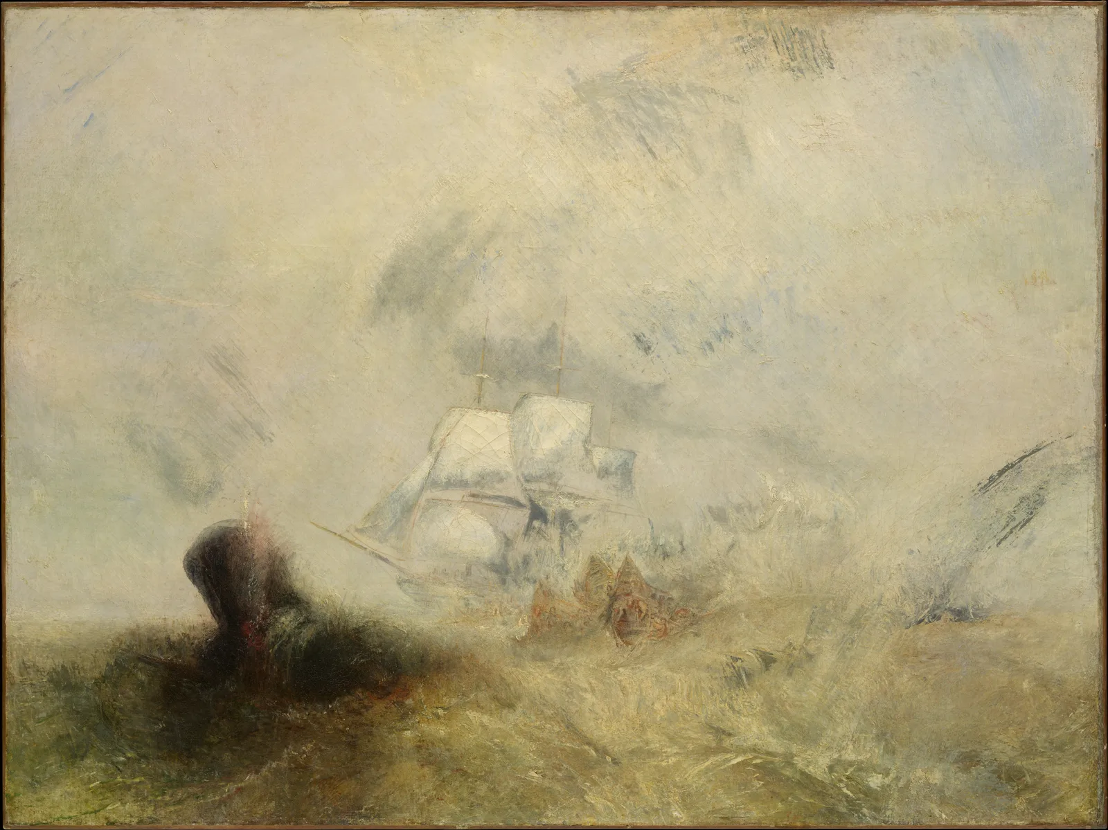
Almost the whole picture is cream-grey. Sky, sea and spray run on in similar colours and similar strokes, so the horizon is hard to find. In the middle a sailing ship emerges as the outline of white sails, and at lower left a dark brown mass rises from the water with a touch of red at its top. Put the title and the Met's description together and it reads as the whale, but the picture alone does not settle it. Below and to the right of the ship, pointed orange and reddish-brown shapes are tangled together; these are presumably the boats.
Even up close, you cannot pick out a single person in these shapes. Gunwales, oars and bodies are mixed in the same orange brushwork. So in this painting there is no figure to measure. The painter who in 1811 painted the folds of a shirt, some thirty years later put people inside a shapeless tangle of colour. The only yardsticks left are one ship and one dark mass, and even their edges blur in the mist.
Why paint them so small? Reading through Burke's sublime
The book most often called on to explain the effect of making people small is Edmund Burke's A Philosophical Enquiry into the Origin of Our Ideas of the Sublime and Beautiful, published in the 1750s. Burke saw whatever excites ideas of pain and danger, whatever is in any sort terrible, as a source of the sublime. Among several conditions he treats two separately. One is size: greatness of dimension, he writes, is a powerful cause of the sublime. The other is obscurity: to make anything very terrible, obscurity seems in general to be necessary, because when we know the full extent of a danger and our eyes grow used to it, much of the apprehension vanishes.
Held against these two conditions, the four paintings fall into order. The people at Saltash are large and clear, leaving no room for fear. The people in Venice are small but not in danger; here smallness is not sublime but a way of showing wide, calm light. In the burning of Parliament, people shrink to a small mass before an enormous fire: the condition of size has arrived. And in Whalers obscurity is added to size. You never learn how big the whale is, how close to disaster the boats are, or how many people are in them. In Burke's terms, it is a danger whose extent you cannot know.
This note has not checked any evidence that Turner read Burke and applied his ideas. So Burke is used here not as a key that proves the painter's intention, but only as a tool for putting into words why people feel so different on canvases of the same size. The Cleveland Museum of Art also describes the fire painting as expressing man's helplessness before the destructive powers of nature, a reading that points the same way as Burke.
What to try in front of a painting
Next time you look at a landscape, find the most visible person and estimate what fraction of the picture's height they take up. Then check whether you can tell that person apart from the next and count them. If people are large and countable, the picture is their story. If they are small but countable, they are a yardstick for a wide space. If you can no longer count them, the picture is probably trying to show something people cannot cope with. In Turner's four paintings, these three cases appear in turn between 1811 and about 1845.
Add your perspective.
Share a question, another approach, or something you have tried.
Checking sign-in…
Loading comments…