When we talk about a print we tend to say “that picture.” Utagawa Hiroshige's Sudden Shower over Shin-Ōhashi Bridge and Atake is a case in point. It is the picture Van Gogh copied in oil in 1887, remembered for the dark cloud at the top, the slanting rain and the people hunched on the bridge. But a print is not one sheet. Put photographs of the same design side by side and they part ways, starting with the sky.
Four sheets released by The Metropolitan Museum of Art and the Cleveland Museum of Art help separate what is cut in the block, what can change with each printing, and what a photograph alone cannot settle. You can do the same anywhere with two photographs of a print.
Hiroshige (1797–1858) was an ukiyo-e artist who was born and died in Edo, today's Tokyo. This print belongs to the series One Hundred Famous Views of Edo and, according to the Brooklyn Museum's record, came out in the ninth month of 1857. The yūdachi of the Japanese title names a kind of summer downpour: late in the afternoon the sky turns dark within moments, and once the rain has passed it soon clears. That gloss follows the Brooklyn Museum's record. The museum records date all four sheets to the same year, 1857.
The cut lines stay put
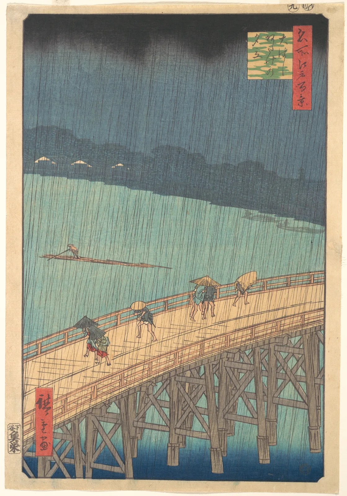
Start with what does not change. Scale the photographs to the picture frame and compare the same areas, and the curve and railing of the bridge, the postures of the people, the raft and raftsman in midstream, and the signature in the red panel at lower left sit in the same place in the same shape. This comparison was made by eye, not with a ruler.
The rain seems to be arranged the same way too. The Brooklyn Museum's record describes the rain as black and grey lines overlaid at different angles, and the Ukipedia entry on this print, on a Japanese print reference site, says the grey and the black were printed from two different blocks. In close-up, fine lines of slightly different darkness and slant do overlap. But the sky of JP643 is on the dark side and its lines are less distinct, so this note does not claim that this sheet's rain comes from the same blocks.
The lower edge of the cloud differs
The dark at the top does differ. On The Met's JP643 the cloud is uneven. The dark sags most a little left of centre and just left of the title panel, and draws back upward between them. On The Met's JP2522 a straight band lies in the same place, with its lower edge crossing the picture close to level.
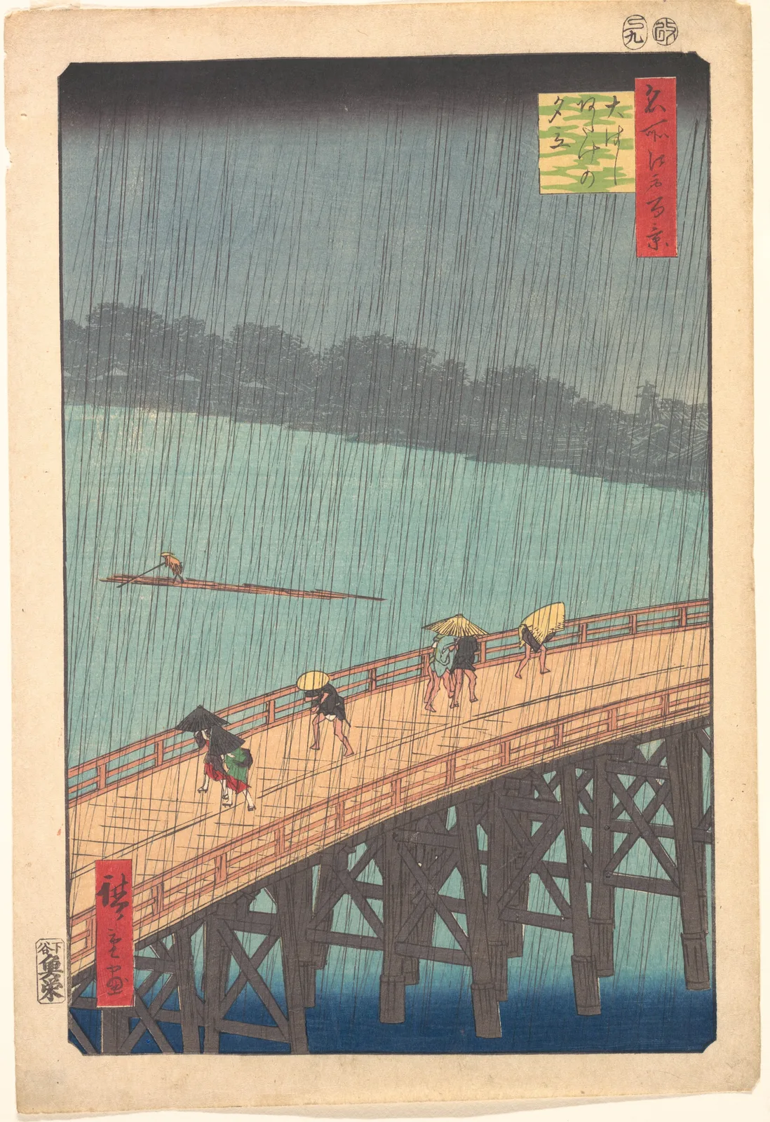
To get a rough measure of this, brightness was read from the photographs. Avoiding the title panel, the span from 5% to 65% of the picture's width was divided into 12 vertical strips, and in each strip the height was found where brightness passes halfway between the dark and the sky below it. Given as a share of the picture's height, measured from its top edge, JP643 runs from about 6% to 10%, a spread of about 4 points. JP2522 runs from about 6% to 7%, a spread of about 1 point. The Met's JP3174, shown below, runs from about 10% to 11%, also about 1 point, so its edge is straight but lower, and Cleveland's 1921.318 stays around 7%, with a spread of under 1 point. These are rough values from photographs and say nothing about the amount of pigment. They serve only for how uneven the lower edge is and roughly how low it sits.
The technique explains how such differences can arise. Wikipedia, citing a book by Julian Bicknell, says these clouds were made with bokashi, or gradation, and differ a good deal from one impression to the next. According to JAANUS, a dictionary of Japanese art terms, the ichimonji bokashi often used for skies works like this: a horizontal strip of the block is wetted, usually with a cloth, a little pigment is spread along that strip, and the sheet is printed. The same dictionary also covers atenashi bokashi, a name it glosses as “indeterminate shading”: water goes on the block first and a little pigment is dropped into it, and the shape and place of the colour change from one impression to the next. The example JAANUS gives of it is another print in the same series. No source was found that says which of these the clouds of JP643 are.
Whose hand did this? The Asian Art Museum in San Francisco, in its education material, describes ukiyo-e production as a collaboration of publisher, artist, carver and printer. In that account the artist handed over a drawing and a hand-coloured proof, perhaps with written instructions, and then stayed out of the printing, so a finished print could at times disappoint him when the printer or carver had changed something. That is not said of this print in particular. Still, it raises the possibility that the lower edge of the cloud was finally set by a printer's hand rather than Hiroshige's. That is this note's inference.
Two boats across the river
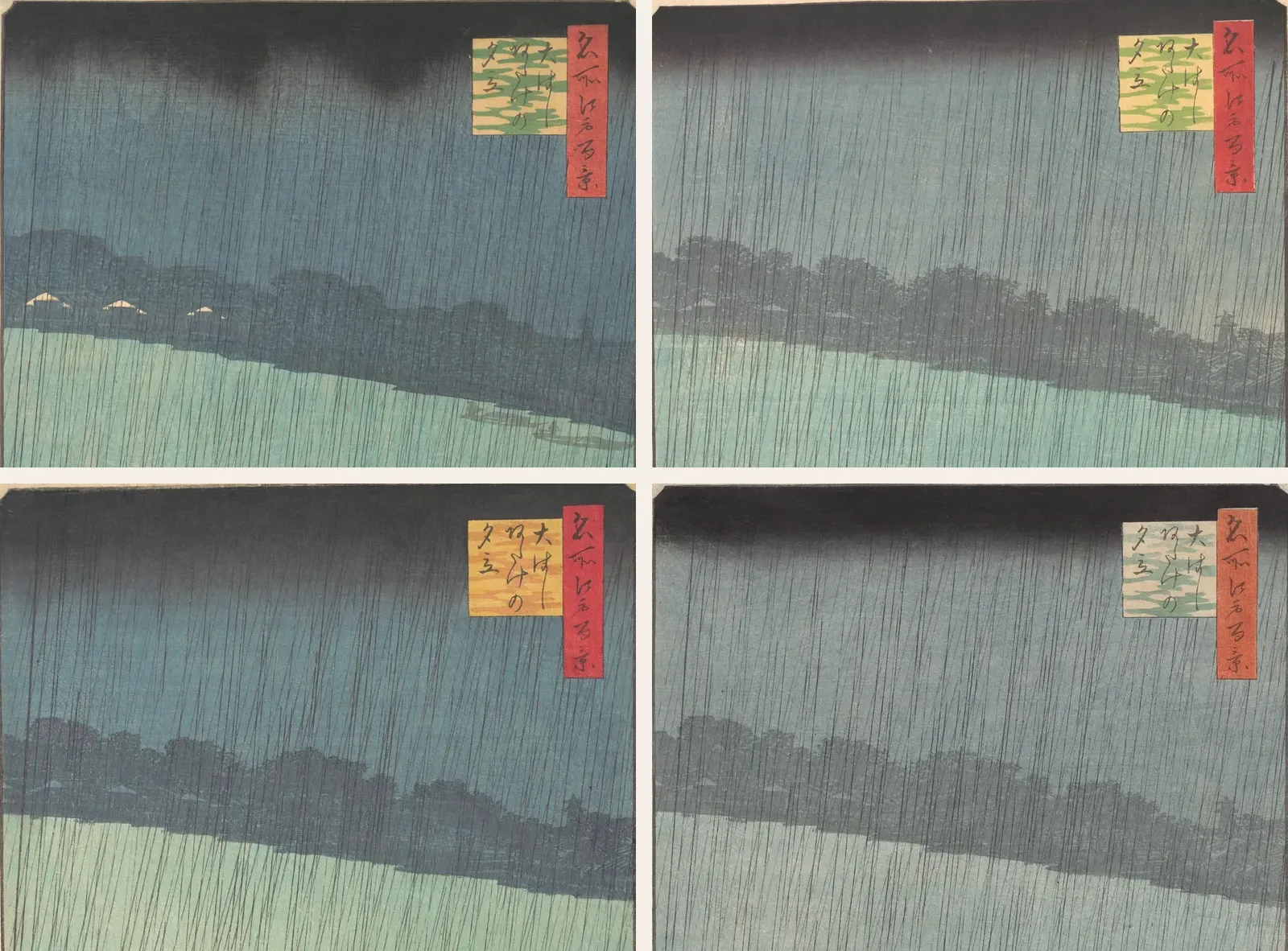
The differences do not stop at the sky. Of the five sheets examined, four from The Met and one from Cleveland, only JP643 shows the outlines of two boats by the far bank at the right. The Met's fourth sheet, JP644, is not shown here. The three roofs on the left bank also stand out white on JP643, while on the others they sink into the trees in grey or pale blue. The boats and roofs are hard to see on a small screen, so it is better to zoom in.
The British Museum calls one sheet in its collection a trial state, listing two boats near the far bank at the right along with a light patch under the bridge. It treats the patch as a slip in cutting the block, put right by the time the first edition was settled. Another sheet in the same museum is described as an early “deluxe” version with more colour and no boats. English Wikipedia, citing a book by Matthi Forrer, suggests the boats were possibly forgotten when a grey background block was recut. The Met's record for JP643 says nothing about its place in the sequence. That the boats put this sheet in the same line is this note's comparison.
The London print dealer Richard Kruml says the states of this design are well documented, but that literature was not read for this note, and the sources that were do not take the order much further. Ukipedia says the cloud on the earliest sheets forms swirls instead of a flat band and here and there comes down as far as the bottom of the title panel. The cloud on JP643 is lumpy, but the height measured earlier is at most about 10% of the picture, around the middle of the panel. Even counting where it fades out, in the photograph it does not appear to reach the panel's lower edge. Sources also disagree about the panel's colours. Ukipedia gives the earliest sheets a three-colour panel, while Forrer, as relayed by Wikipedia, says it became three-colour in later printings. Kruml finds the colour and gradation of the supposed earliest state unattractive. That is one dealer's opinion, but it is a caution against assuming that earliest means best. So no order is assigned here to the four sheets.
What a photograph cannot settle
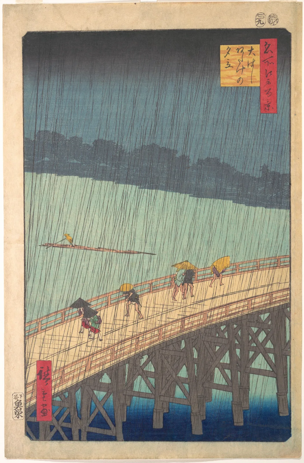
The colour differences are even more noticeable. JP3174 has an orange-yellow ground in the title panel, and its hats and raftsman are an unusually strong yellow. Cleveland's 1921.318 has a bridge deck close to pink, an off-white title panel and an orange signature panel. The bridge piles are a pale grey-brown on JP643 and a dark grey-brown on JP2522.
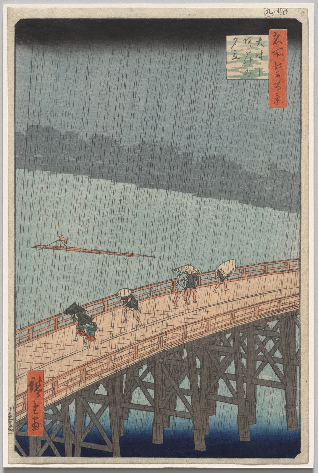
Even so, these cannot be read straight off as printing differences, because the colour chosen at printing, fading over time, and photography and colour correction all overlap in one photograph. The photograph Cleveland publishes under 1985.318 is a case in point. Small marks in the margin and the breaks in the rain lines match 1921.318, so it looks like the same sheet photographed again, yet the black of the cloud and the tone of the sky come out slightly differently, and the margin paper comes out noticeably greyer. The record under that number also seems not to match the photograph in size, signature or publisher, so it is not counted here as a separate sheet. Since what looks like one sheet changes colour this much between photographs, the measurement above keeps to the height of the cloud's lower edge and leaves colour out. Even that height differs by up to about 0.5 point between these two photographs, so differences under 1 point are not read as meaningful here. Everything here was read from photographs, not from the sheets themselves.
Which sheet is the real one?
So which sheet is the real Hiroshige? A distinction from the philosopher Nelson Goodman helps sort out the question. In Languages of Art (1968) Goodman called an art autographic when even the most exact copy does not count as genuine. As the Stanford Encyclopedia of Philosophy summarises it, etching belongs here even though it exists in many sheets, because what matters is not how closely something looks alike but whether it is connected through its history of production.
Carrying this test over to woodblock prints is this note's reading. Carried over, it means the four sheets are not one original and three copies. A different sky gives no ground for choosing one as the real one. But the production history of this print includes a carver, printers and a publisher besides the artist, and if the background block really was recut, “the same block” becomes a looser phrase too. So the name Sudden Shower is closer to the name of a design that holds many sheets together than to any one sheet's sky.
Three places to check on two sheets
With two photographs of an ukiyo-e print, check three places in turn. First, is the lower edge of the band at the top straight or lumpy? Second, does the distant background have something on one sheet only? Third, look at colour last, and hold off judging even if it looks different. And when you talk about the print, give the collection and the number with it. Which sheet you saw is part of what you are saying.
That gives the first question its answer. On the sheets examined here, at least, the sky is not the same. What the four sheets shown share are the cut lines of the bridge and the people, and the dark cloud may have been made anew at each printing.
Add your perspective.
Share a question, another approach, or something you have tried.
Checking sign-in…
Loading comments…